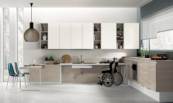
Sélectionnez votre langue :
Trouver un revendeur Services Après-vente
The play of contrasts in living areas
Magazine

The play of contrasts in living areas

Colour combinations that give character to the living areas.

Not only do the furniture and its style give character to a room. To give the room strong personality some special finishes used in quite original combinations of colours and materials can be implemented

The use of bi-colour is always popular and, if you choose fresh and bright nuances, it becomes suitable for a youthful and brilliant composition.

The use of bi-colour is always popular and, if you choose fresh and bright nuances, it becomes suitable for a youthful and brilliant composition. Turquoise, a trend colour this year, is a high-impact shade that perfectly combines with white in the composition on the right.

The contrast between the modules of the base and wall units is highlighted and made more dynamic by the difference in size and style.

Contrast can also be achieved by combining different materials. In the photo on the right , lacquered interacts perfectly with the glass.

The presence of two materials like lacquered and glass embodies a contemporary aesthetic thanks to the geometry of the kitchen.

The result is an ambiance that selects a contemporary look which targets a refined and modern design.

Home
Magazine
Coloris et matériaux
The play of contrasts in living areas