Choosing Colours for the Walls of Your House
The subtleties of colours and how to use them
Sometimes however the fear of a mistaken choice and the lack of expertise with non-traditional colours makes us renounce the project.
If the room is oriented towards the north it will get less illumination...warmer colours are better.
Preliminary criteria for choosing
You need to consider two principle criteria before making your choice:- subjective criteria: the same colour can be percieved in different ways by different people.
That's why it's important to heed your own tastes, and not let yourself be completely influenced by trends, especially when you are not convinced.
- objective criteria: colours vary with changing light, whether the light be natural or artificial.
And you need to take into account the exposure of the different spaces: the quantity of openings and their orientations, the period of the day in which a space is occupied and the duration of time you normally stay there.
In general:
1. if the room is oriented towards the north it will get less illumination and warmer colours are better (beginning with yellows, but also other tones, as we will see), whereas if the room is facing south, even neutral or cold tones can be good; for eastern exposure, light, non-cold tones are best; for western exposure you can tend towards a predominantly cold palette;
2. for rooms that are frequented more often and for longer periods of time use light colours that are less tiring.
Unusual colours are good for less used spaces, very bright or very dark colours can highlight architectural details like frames, pillars, columns or niches. The use of a strong colour on portions of a wall can be also effective.
3. rooms illuminated with flourescent lights are balanced by warm tones; incandescent lights allow cold colours. Halogen lights tend towards white and for this reason allow any type of colour.
General criteria for use
To know if a colour is suitable for a space, you need to consider the use of the space. Colours can influence mood and therefore facilitate or obstruct activities undertaken in the room.
White: adding a drop of colour to a white base, you get a "dirty white" like beige, honey, almond (warm colours), or ice or pearl white (cold tones). These are in any case considered neutral because they give uniformity to a space. They are suitable for all situations.
Black: it's not recommended for entire walls, but can be used well to accent details (frames, mouldings, etc.). Dark grey (cold) and ebony (warm) are also part of this range.
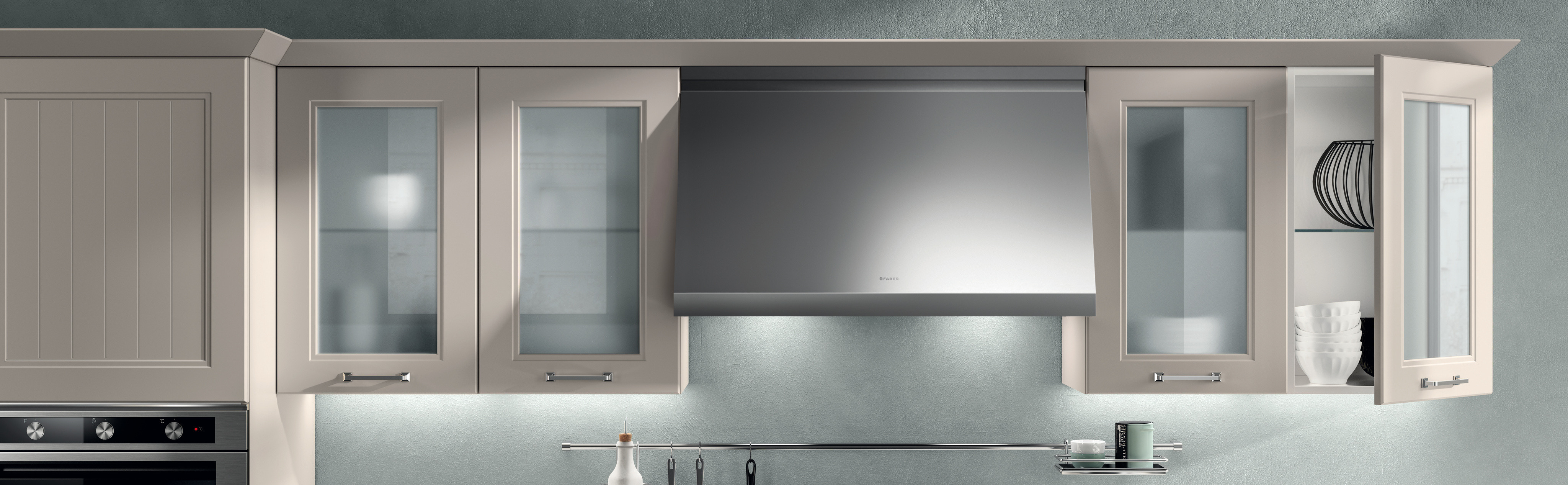
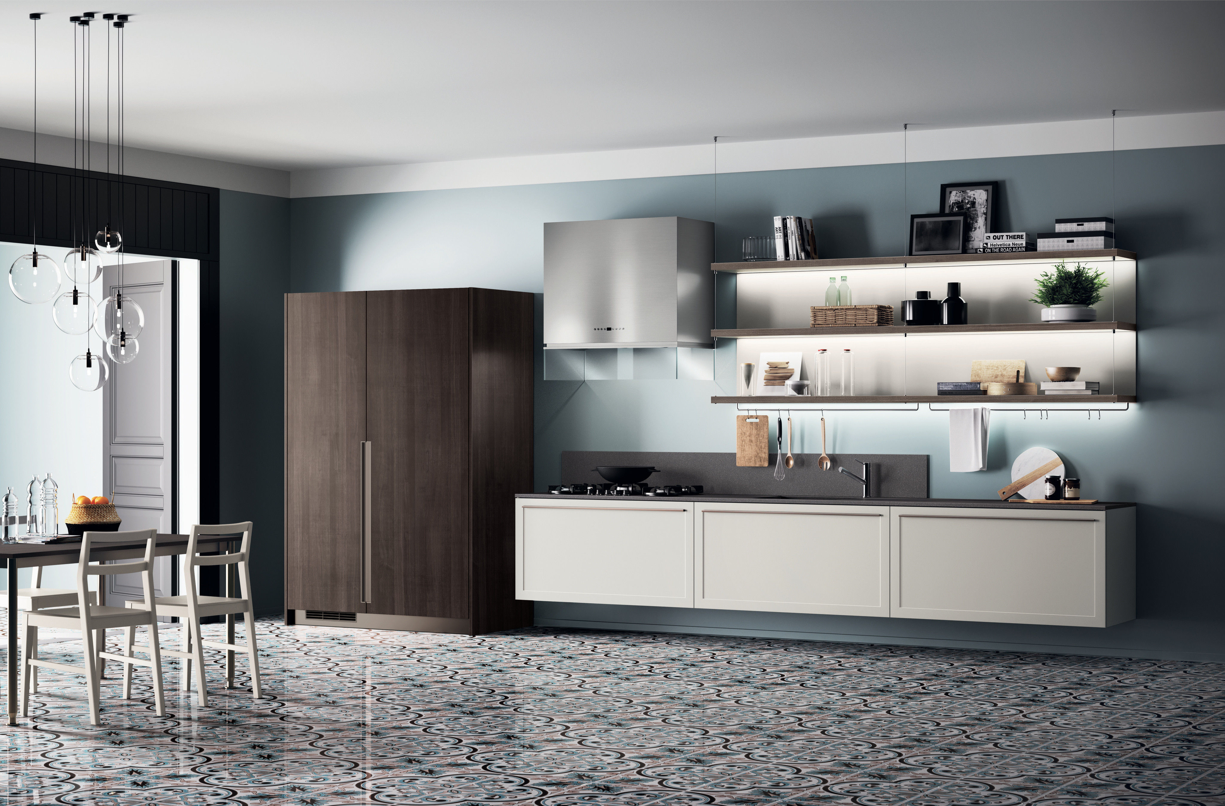
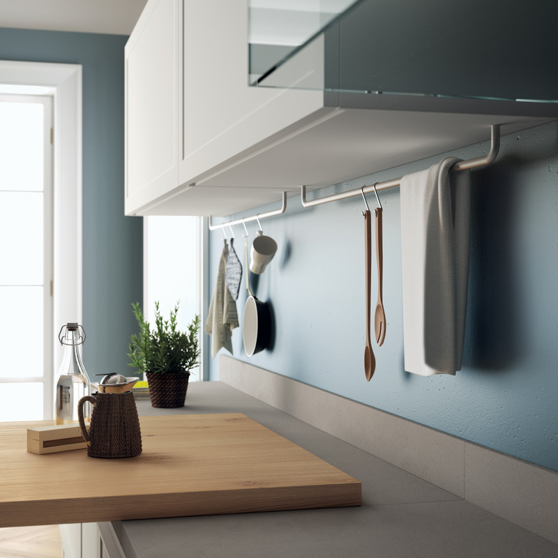
Grey: at the moment, grey is fashionable and can have cold tones (with a touch of blue) or warm tones (with a touch of red or yellow). For the kitchen, warm greys are best.
Yellow: cold yellows go well with blue-greys. They stimulate concentration and sociability so they are perfect for a studio or living room.
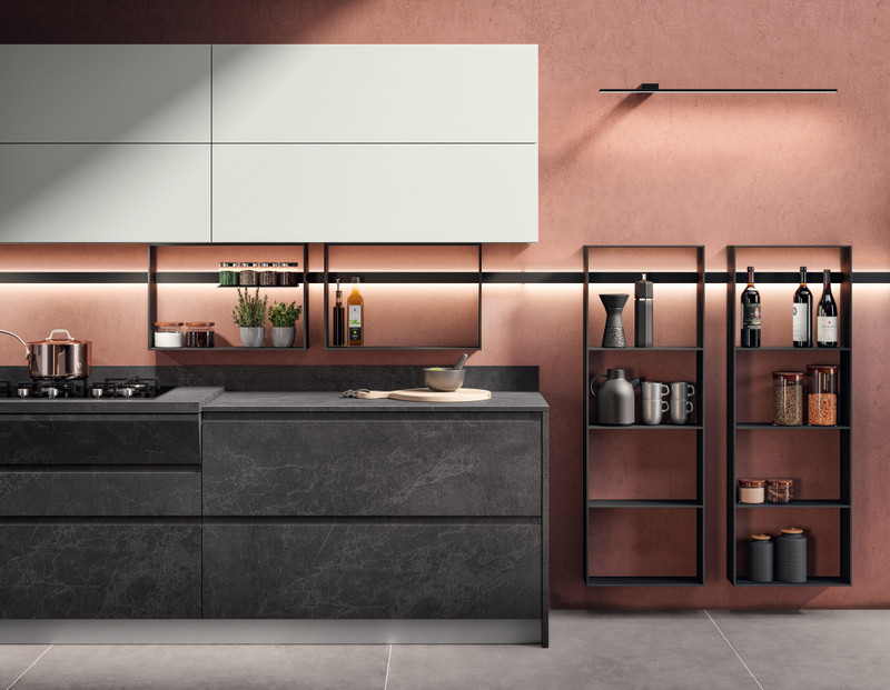
Red: it has a strong effect on mood and transmits a lot of energy: it's best to use it in spaces you are not going to spend a lot of time in (you might get agitated). Brilliant reds are fashionable. Very good for the kitchen too, if not used for all the walls.
Pink: used for entire walls in soft tones that range from antique pink to salmon or in pastel tones applied to partial surfaces or details. Lilac is suitable for the living room.
Earth tones: this category includes red-ochres, coral, rust and terracotta. If you choose a brownish tone you can create a "boiserie" effect, limiting it however only to a few walls.
Blue: relaxing, should be used mostly for the bedroom.
Green: a neutral colour (neither warm nor cold) and it is very relaxing and balancing.