Magazine
Style and colour guide for your kitchen
Read
Base your important choices on these fundamental decisions
Thanks to the overwhelming range of furniture, panelling and accessories available on the market, the kitchen is one of the most complicated rooms to decorate.
A good starting point is to take inspiration from the architectural style of the house. If it's a modern building, your stylistic choice could very well go along with that.
Style
First of all, you must ask yourself a series of questions regarding what you would like in terms of visual effect and you must calmly evaluate the real furnishing possibilities offered by the room.A good starting point is to take inspiration from the architectural style of the house where your kitchen will be.
If it's a modern building, your stylistic choice could very well go along with that.
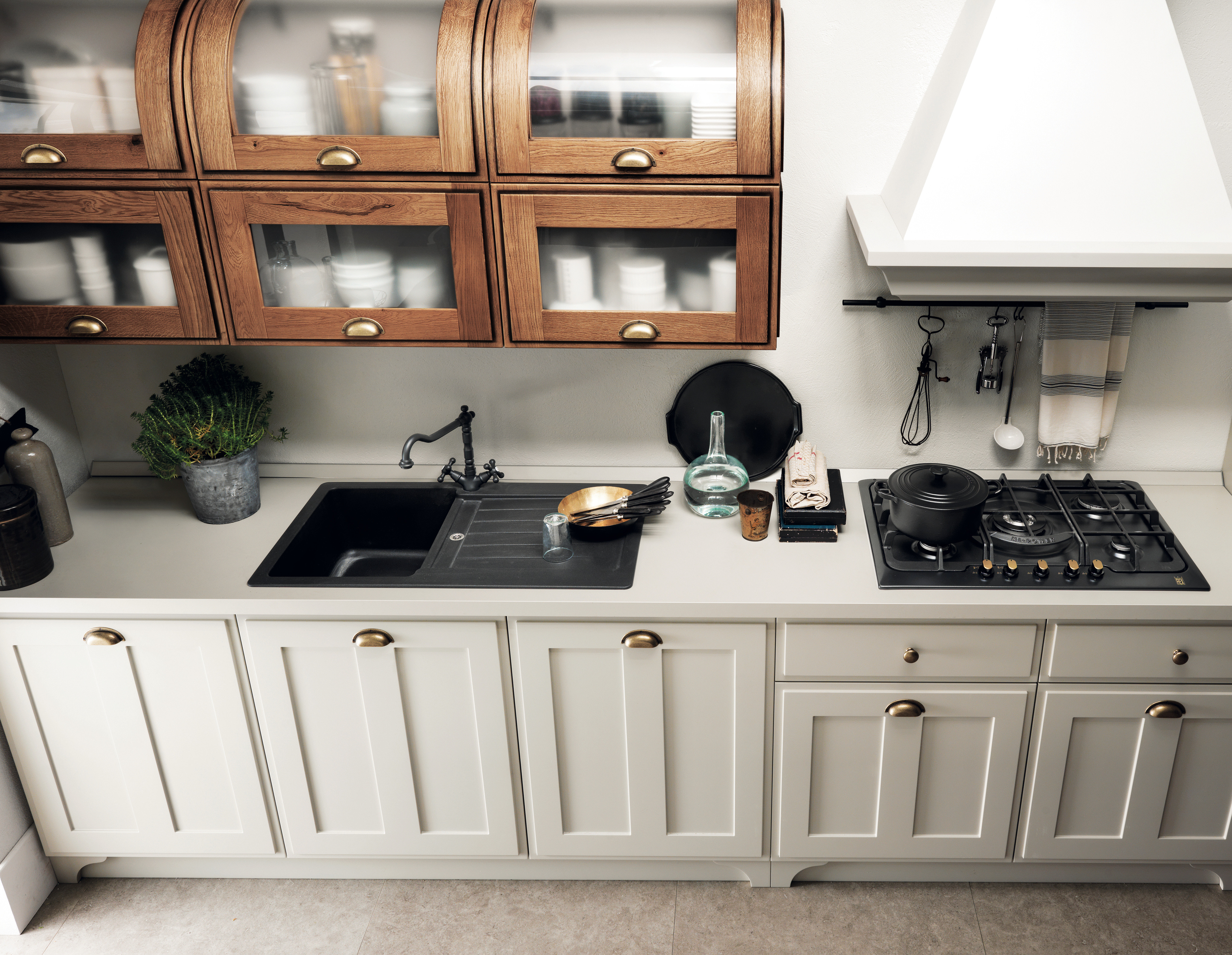
On the other hand, if it's a classic style or even antique building, you can use that as a solid guide in your choices of traditional materials and colours.
Notwithstanding this, strong personal tastes may over-ride this simplistic base characterization.
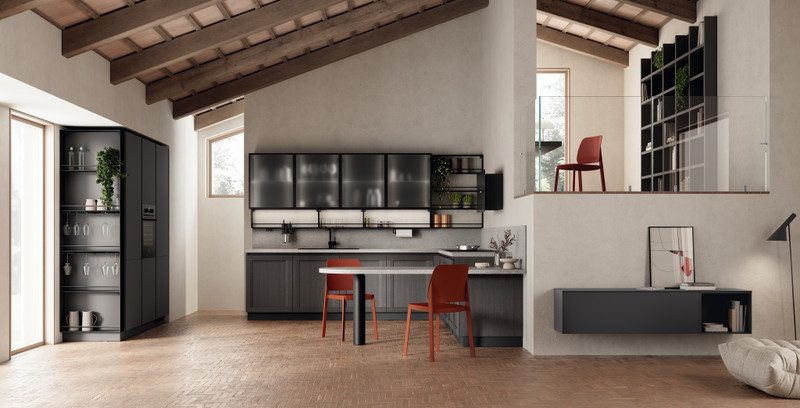
Colours
Once you've decided on a style for your kitchen, you can move on to choosing the palette of colours you will use in the kitchen environment, so that each element harmonizes with the whole.Begin by establishing three fundamental colours: the principal colour will be that of the kitchen furniture or the walls (should you decide not to leave them white), the second colour will be that of the floor, while the third most important colour will be for the counter tops.
These colours will have respective weights of 60, 30 and 10% of the whole.
The choice of your palette is extremely personal and will depend above all on the kinds of feelings you want to evoke in the occupants of the room.
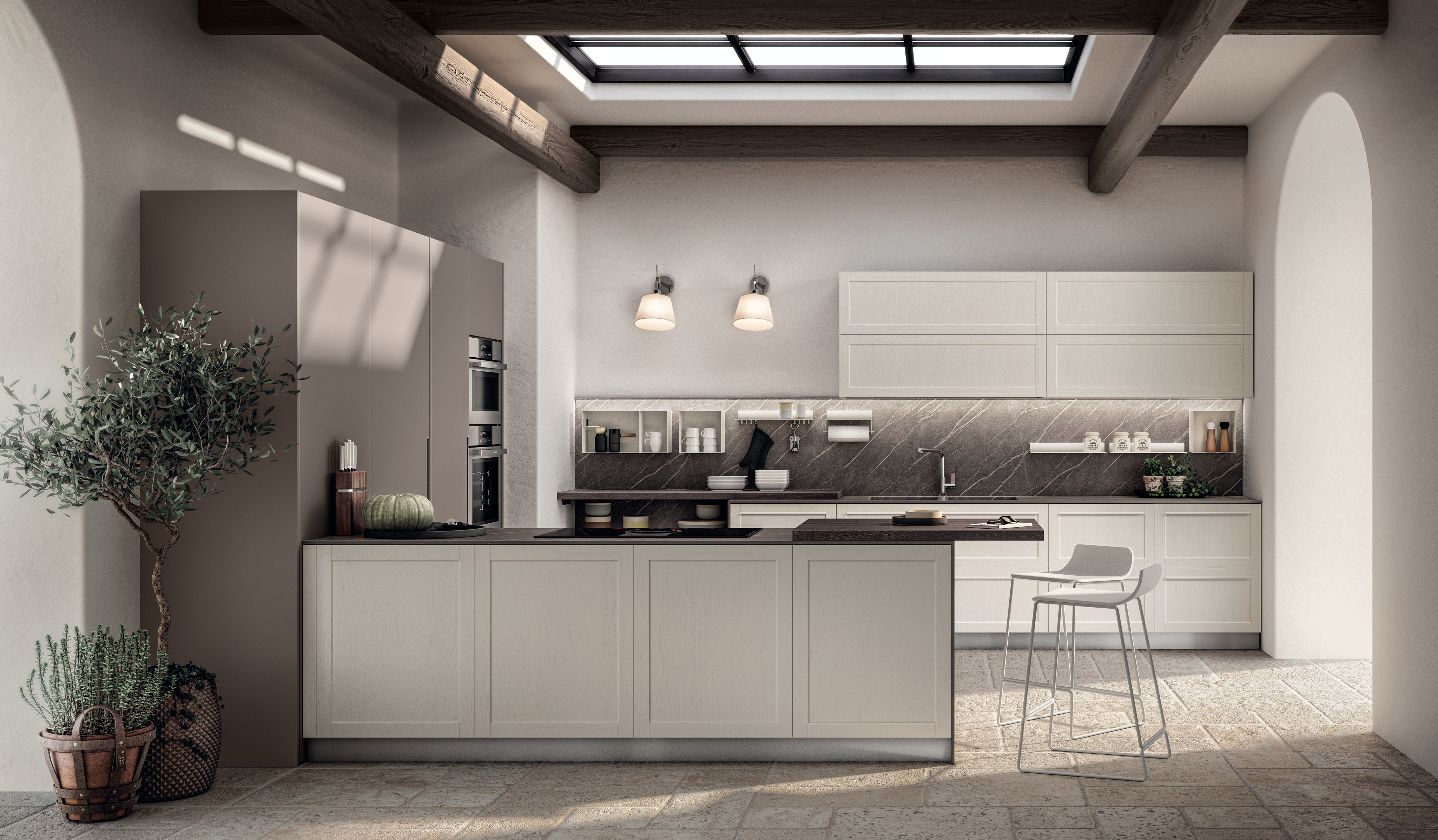
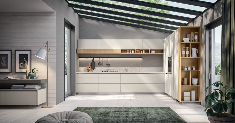
Again, to simplify things we can generalize the options: a white based palette, a colourful palette or a palette in which natural shades of colour dominate.
In the first case, your choices will have a refined and minimalist look.
Obviously not everything will be pure white; you can introduce touches of colour in the details: the counter top, the backsplash, borders or outlines on the floor, the wall tiles, and don't forget accessories like rugs, curtains, towels, etc.
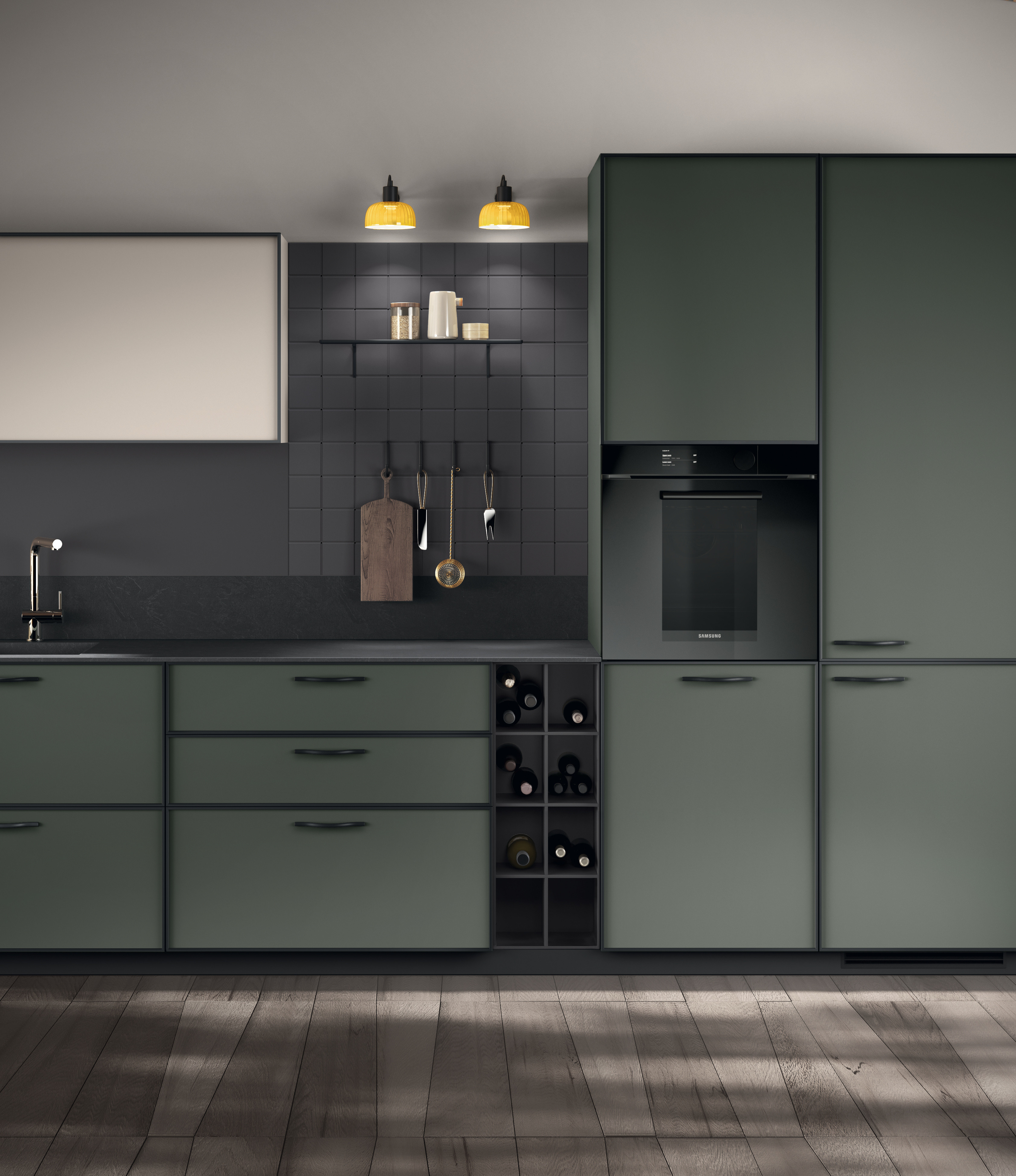
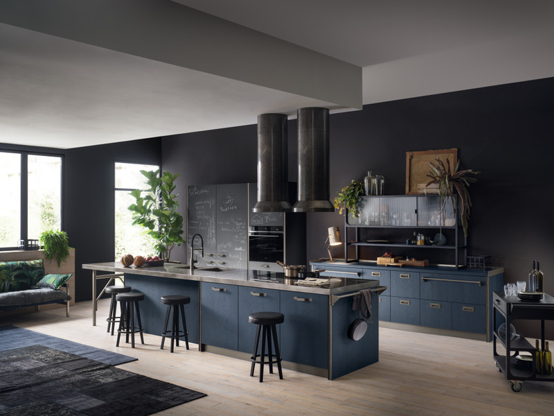
If your chosen palette is colourful, whatever your choice of colours, you will have a stimulating and up-to-date style.
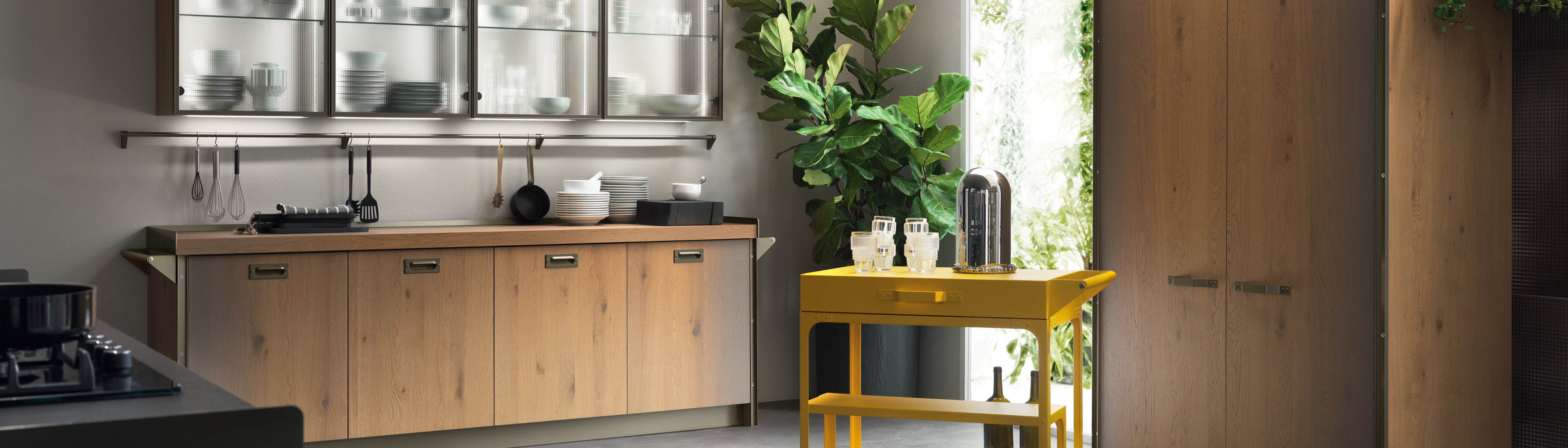
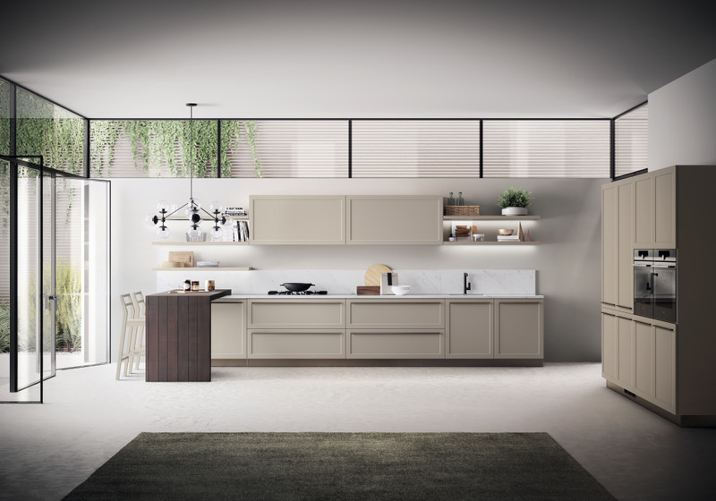
A palette with natural colours typically consists of earthy tones, or at most a saturated yellow, and uses details like natural bricks, wood and metal.
These materials communicate honesty and simplicity.
Again, to simplify things we can generalize the options: a white based palette, a colourful palette or a palette in which natural shades of colour dominate.
In the first case, your choices will have a refined and minimalist look.
Obviously not everything will be pure white; you can introduce touches of colour in the details: the counter top, the backsplash, borders or outlines on the floor, the wall tiles, and don't forget accessories like rugs, curtains, towels, etc.
If your chosen palette is colourful, whatever your choice of colours, you will have a stimulating and up-to-date style.
A palette with natural colours typically consists of earthy tones, or at most a saturated yellow, and uses details like natural bricks, wood and metal.
These materials communicate honesty and simplicity.
Applying colours to the architecture
Finally, colours can be used in decorating to visually modify small architectural defects. It's helpful to remember:1. Fresh, light and calm colours, and minimal contrast visually help to enlarge a space, lenghthen a room and raise a low-ceiling.
2. On the contrary, warm, dark or lively colours, together with high contrast can be helpful for shrinking a space, shortening a long room or lowering a ceiling.
04 May 2022
Related Contents